Garmin Pilot
Creating a companion website for Garmin’s flight planning app, and enhancing the iOS experience for pilots on the go.
- Role
- Lead designer
- Timeline
- 2 years
- Platform
- Web, iOS
- Tools
- Figma, Adobe CC

Impact
In spring 2025, Garmin Pilot Web launched, bringing the full Garmin Pilot experience to desktop and laptop for the first time.
- Users in the first nine months
- 50,000+
- Sessions in the first nine months
- 136,000+
- Engagement rate
- 2.7x
Phase 1
A fresh opportunity
In Fall 2022, Garmin Aviation set out to reimagine its web presence, an ambitious project with a history of false starts but enormous potential. This marked the third attempt to overhaul the platform, with renewed focus, clarity, and a commitment to finally bring the vision to life.
I was appointed as the first and only designer on the project.
Getting my bearings
I kicked off the project by conducting research both within and beyond the aviation industry and held countless meetings with stakeholders to uncover needs and align on direction.
At this stage, one thing was clear: no one knew exactly what they wanted, and it would take many iterations to get it right.

Visual direction
Before diving into UX, I took the initiative to create a visual design workbook to explore direction and create alignment. After several iterations and a presentation to leadership, the final version laid a strong visual foundation, setting the stage for the design system work that followed.

Phase 2
UX kickoff
Eventually, I was joined by another designer, and together we began tackling some of the project’s most pressing questions. Key debates were still unresolved, ranging from overall site structure to the role of the map and flight planning page, user interaction patterns, and the availability of map overlays.
To accelerate decision-making, I initiated a series of design sprints. These sessions brought together stakeholders from design, development, and leadership to collaborate. I created a flexible sprint template that worked for both in-person and remote participants.


Sprint results
By the end of the five-day sprint, we had clear direction for the website’s overall structure and the flight planning experience.
Over the following months, we focused on refining and implementing this experience, turning ideas into actionable solutions.

Phase 3
Garmin Pilot companion
While our initial iteration had clear flaws, it aligned with leadership’s vision at the time. However, we faced an unexpected shift in direction during the summer of 2023: what was initially planned as the next generation of FltPlan.com was redefined by marketing and leadership to serve as a companion website for the Garmin Pilot iOS app.
I began another design sprint with the team. Since this shift both web and iOS are designed hand in hand. This shift also initiated the iOS design system.

The home stretch
After the dust had settled from the last design sprint, I could focus on polishing features and delivering requirements to developers.
I delivered the following product features.
Feature
Flights
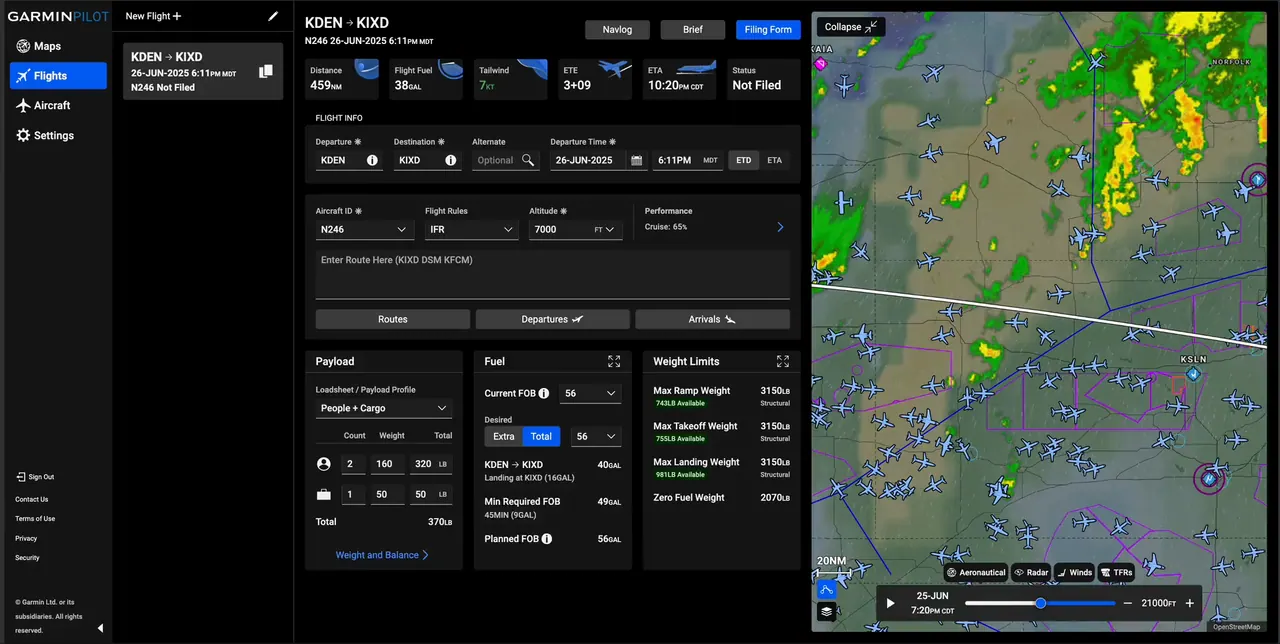
The Flights page is one of the most critical parts of the app, serving as the pilot’s dashboard for everything related to planning and executing a flight.
I focused heavily on refining the form flow, improving visual hierarchy, defining responsive breakpoints, and mapping out clear user journeys to ensure a seamless experience across devices.
Since web and iOS were intended to be companion platforms, each were designed side by side.
Challenge
Aesthetics
One early critique of the Flights page was that it didn’t look visually appealing. To address this, I introduced small illustrations placed on key data cards at the top of the page. These visuals added personality and helped create a more engaging, polished experience.

Challenge
Breakpoints
The website needed to function seamlessly down to an iPad Mini screen size. I defined responsive breakpoints and designed a modular map section that could expand or collapse across all screen sizes. This not only improved usability on smaller devices but also mirrored the layout of the iOS Flights page, creating a more consistent experience across platforms.
Challenge
States
We worked with developers to redefine flight filing states for web and mobile. This helped make filing status more clear for the user and better align with industry conventions.

Feature
Map
The map is another essential part of the app, it’s where every user begins and where much of the flight planning process takes place. It serves as a dynamic hub of critical information.
I created modular pop ups to allow users to flightplan, search, adjust overlays, and interrogate map information. One key shift I introduced in the web experience was enabling users to directly interact with map elements.

Challenge
Time slider
One of the biggest challenges on the map was designing a unified solution for the time slider used to play through weather and traffic data. In the existing iOS app, each active layer displayed its own slider, altitude selector, and settings.
After conducting usability tests, it became clear that users preferred the simplicity and clarity of a single, centralized control, over multiple controls with longer data ranges.

Challenge
Selection
To better leverage the capabilities of desktop, we removed the app’s contextual menu for map interactions and introduced direct selection and hover states instead. This allowed users to interact with map elements more intuitively using a mouse. Implementing this required defining the interaction behavior and layering logic for each map element.

Feature
Aircraft
The Aircraft page is often overlooked, as users don’t interact with their aircraft settings frequently. However, designing this section came with unique challenges due to the sheer volume and variety of data inputs required.
To address this, I introduced new input guidelines into the design system, developed a secondary navigation pattern optimized for the Aircraft page (and scalable across the app), and centralized all aircraft content into a single, organized hub.

Launch!
GP Web was launched in the spring of 2025. We have many more features and improvements in the works.